12_
WHITE ASH TYPEFACE
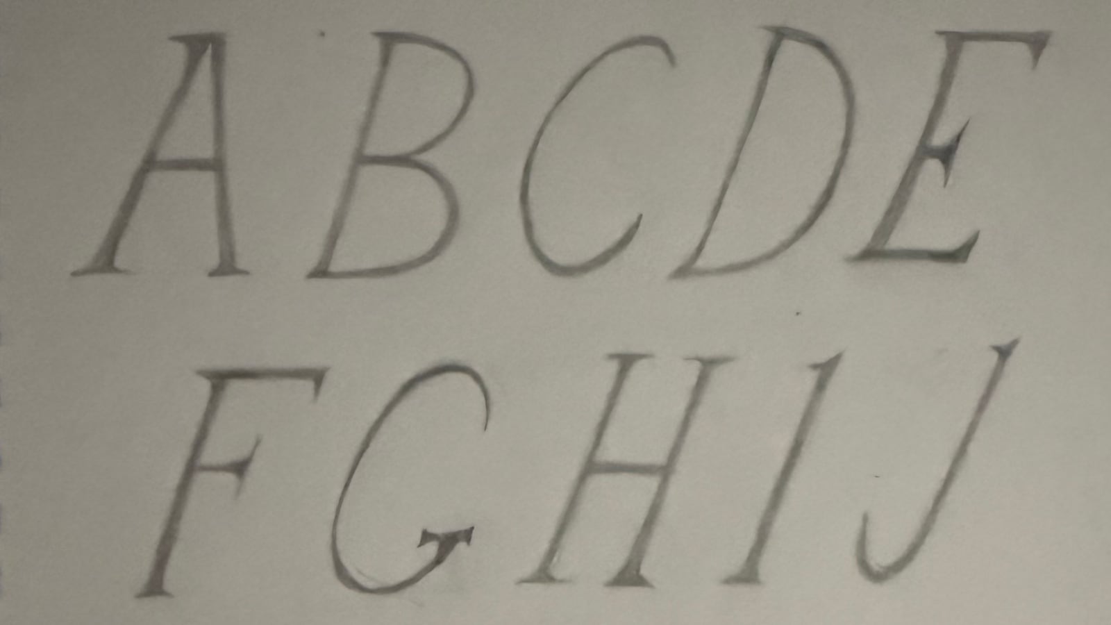
Drag the sheet. Pencil underneath, the finished typeface on top.
From an alphabet in my notebook to the typeface for my clothing brand.
01_ THE DRAWING
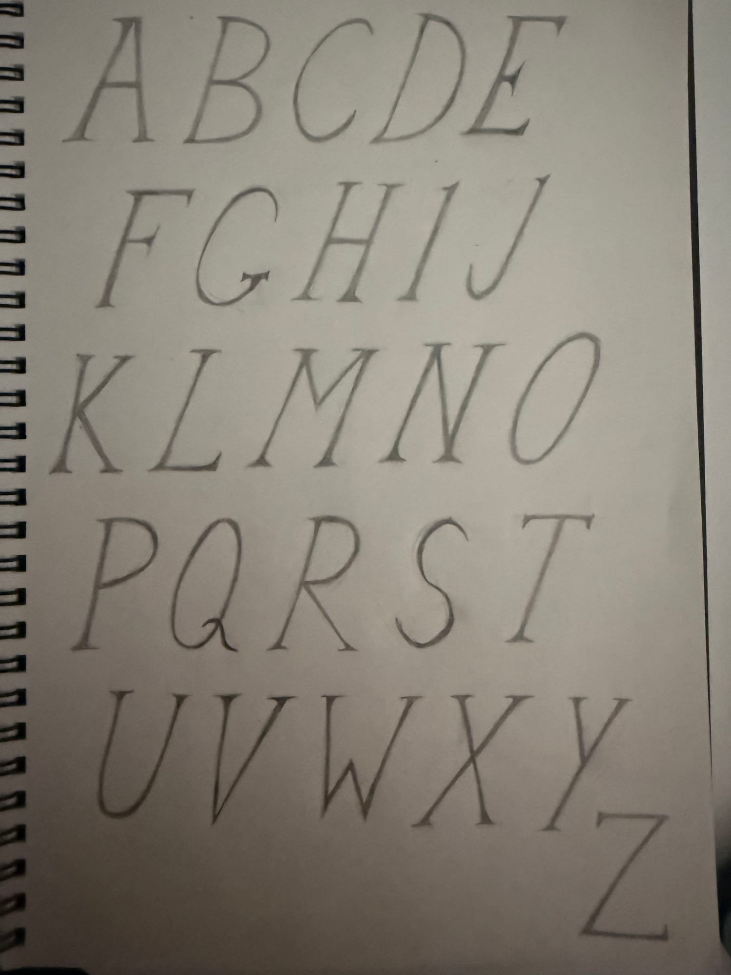
I drew an alphabet in a notebook and wanted to see if I could turn it into a typeface. White Ash began with that page: the thin strokes, the long serifs, and the way the letters lean forward.
02_ LETTER BY LETTER
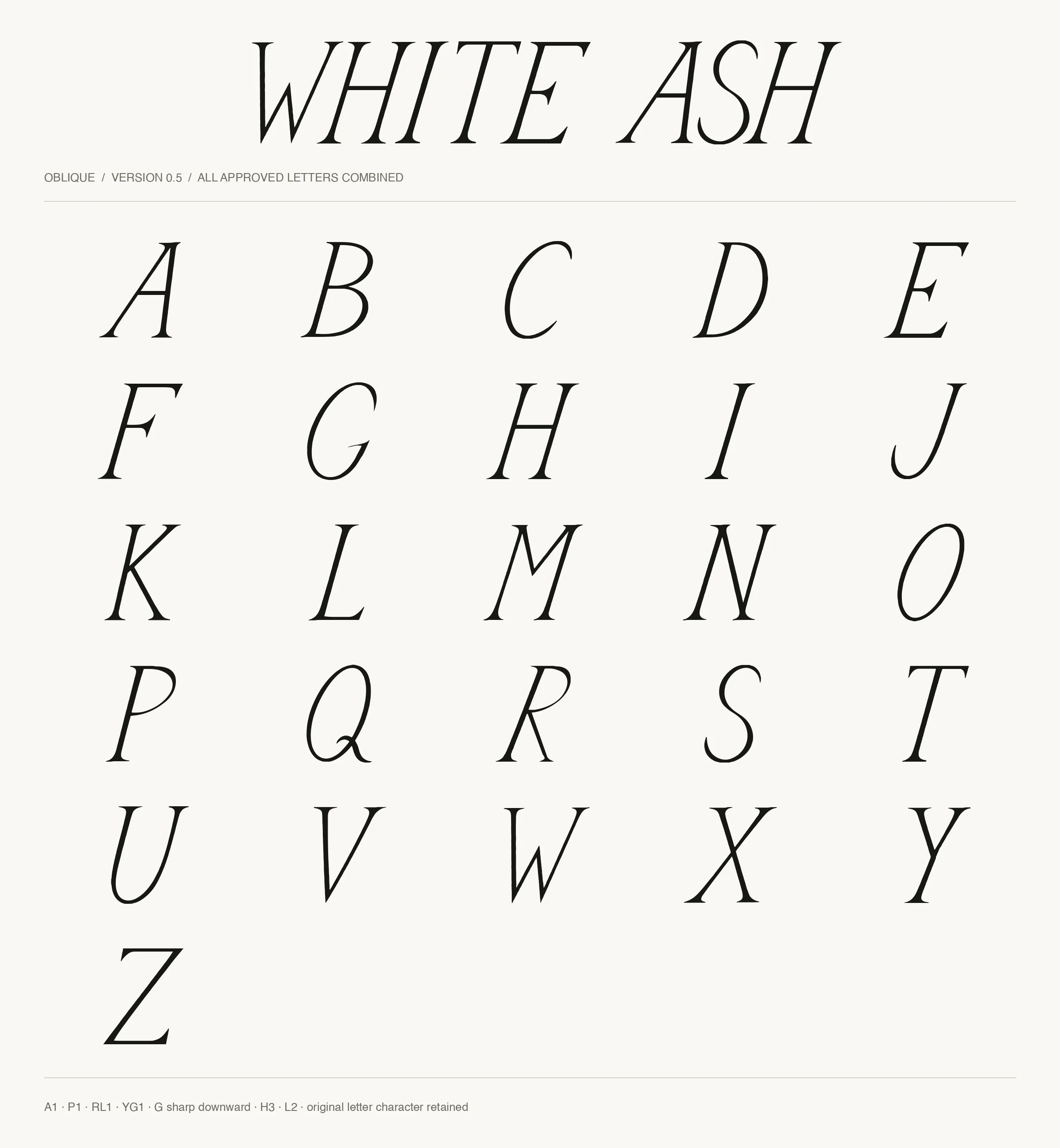
I worked with Codex to turn the drawing into a font, reviewing the letters in comparison sheets as we went. The small decisions mattered: how the G turned inward, how wide a letter felt, and how the shapes sat beside one another.
Reshaped after the first font, 0.1 · Oct 6
Inward stroke curves down to a sharp tip
NOPQRSTUVWXYZ
GInward stroke curves down to a sharp tip
The working sheets · Oct 6 to 9
03_ THE FINISHED TYPEFACE
The alphabet grew into three styles: the original, Companion Light, and Companion Bold. Numbers, punctuation, accents, and symbols followed. I now use the typeface for my clothing brand, White Ash.
Try it
WHITE ASH